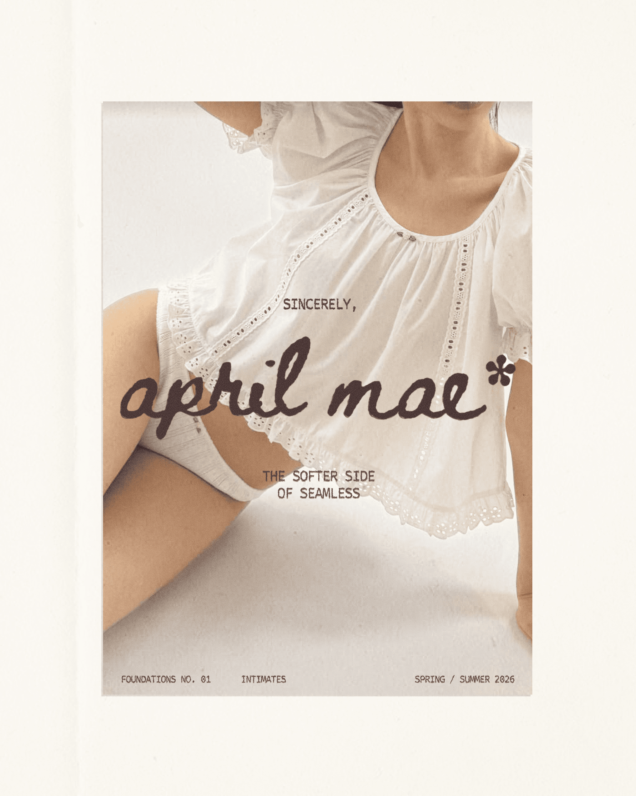
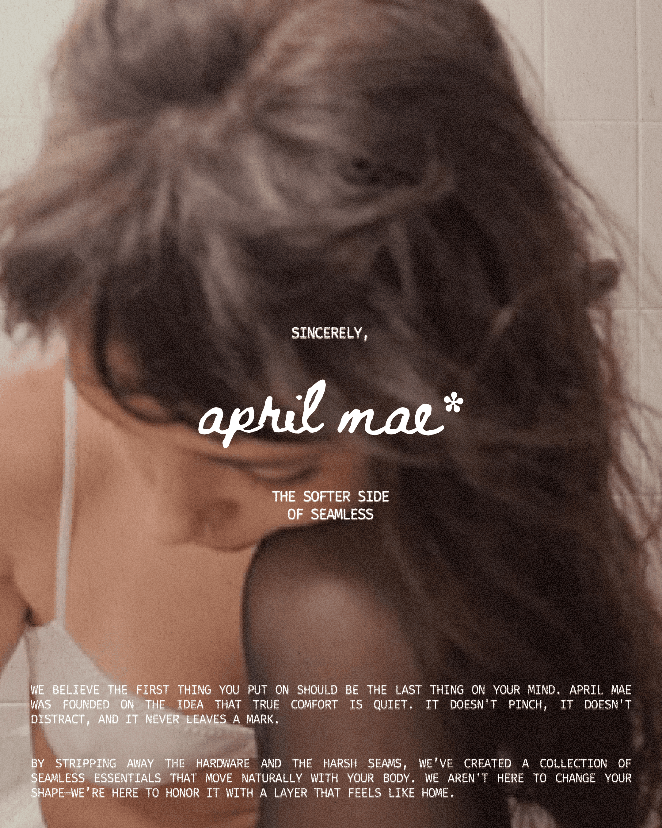
april mae
A comprehensive branding and packaging project for a boutique intimates label. Inspired by the transition of early spring, the identity utilizes soft-focus photography, a soft iconographic system, and minimalist editorial layouts to define a new standard for everyday comfort.
COLORS
A palette of sun-bleached whites and airy blues designed to feel like a fresh start. These soft, tonal layers reinforce the brand’s commitment to lightweight comfort and a "second-skin" fit.
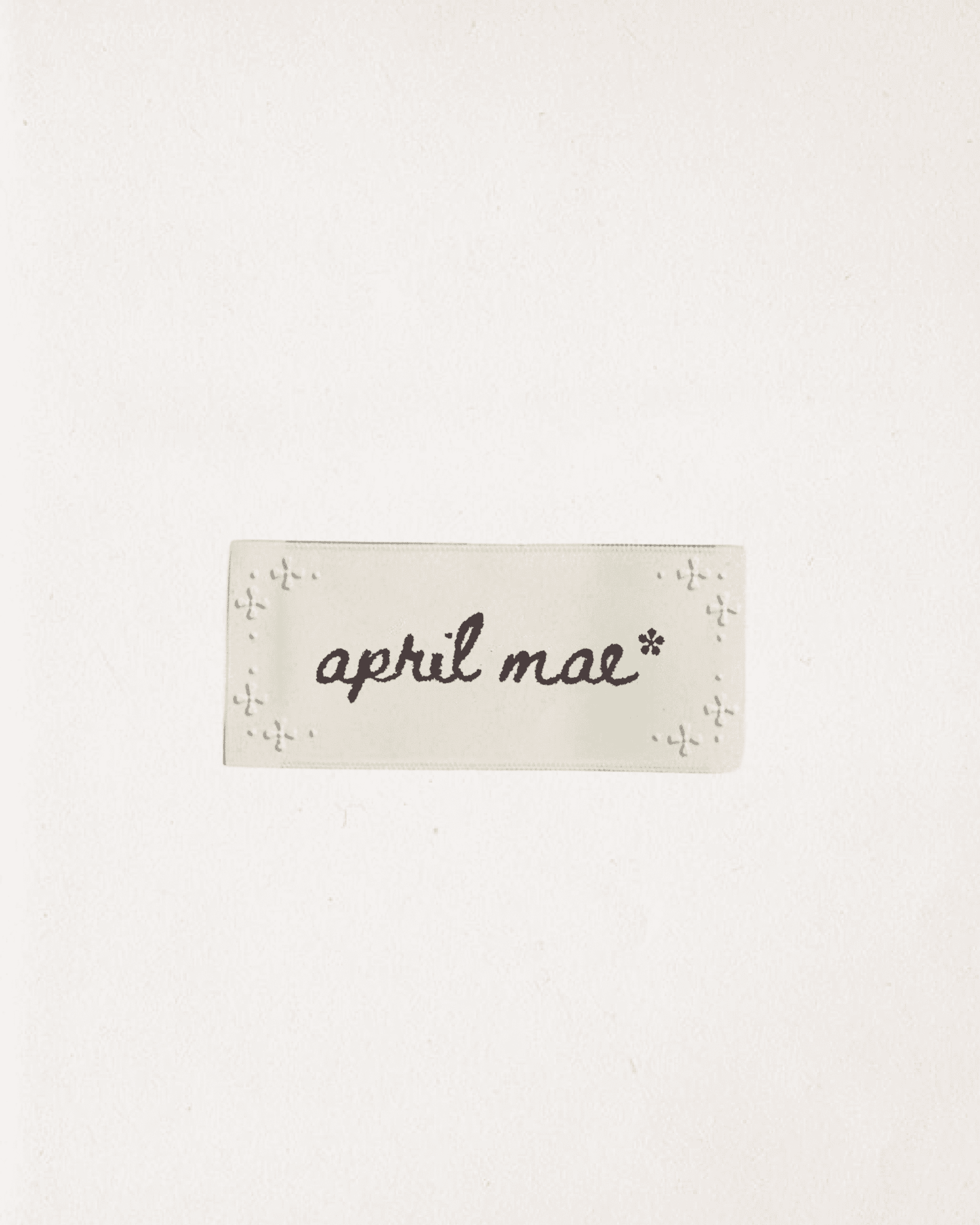
TYPOGRAPHY
Minimal, editorial typography used sparingly to maintain authority and quiet confidence.
PACKAGING
A utilitarian envelope system designed with "distraction-free" copy, ensuring the first touchpoint is as smooth as the garment inside.