noma
A complete identity and digital experience for a Japanese furniture brand shaped by the balance of space and structure. Using a restrained, editorial approach and a grounded color story, the design creates a sense of spatial calm that completes the brand’s narrative across all platforms without competing for the viewer’s attention.
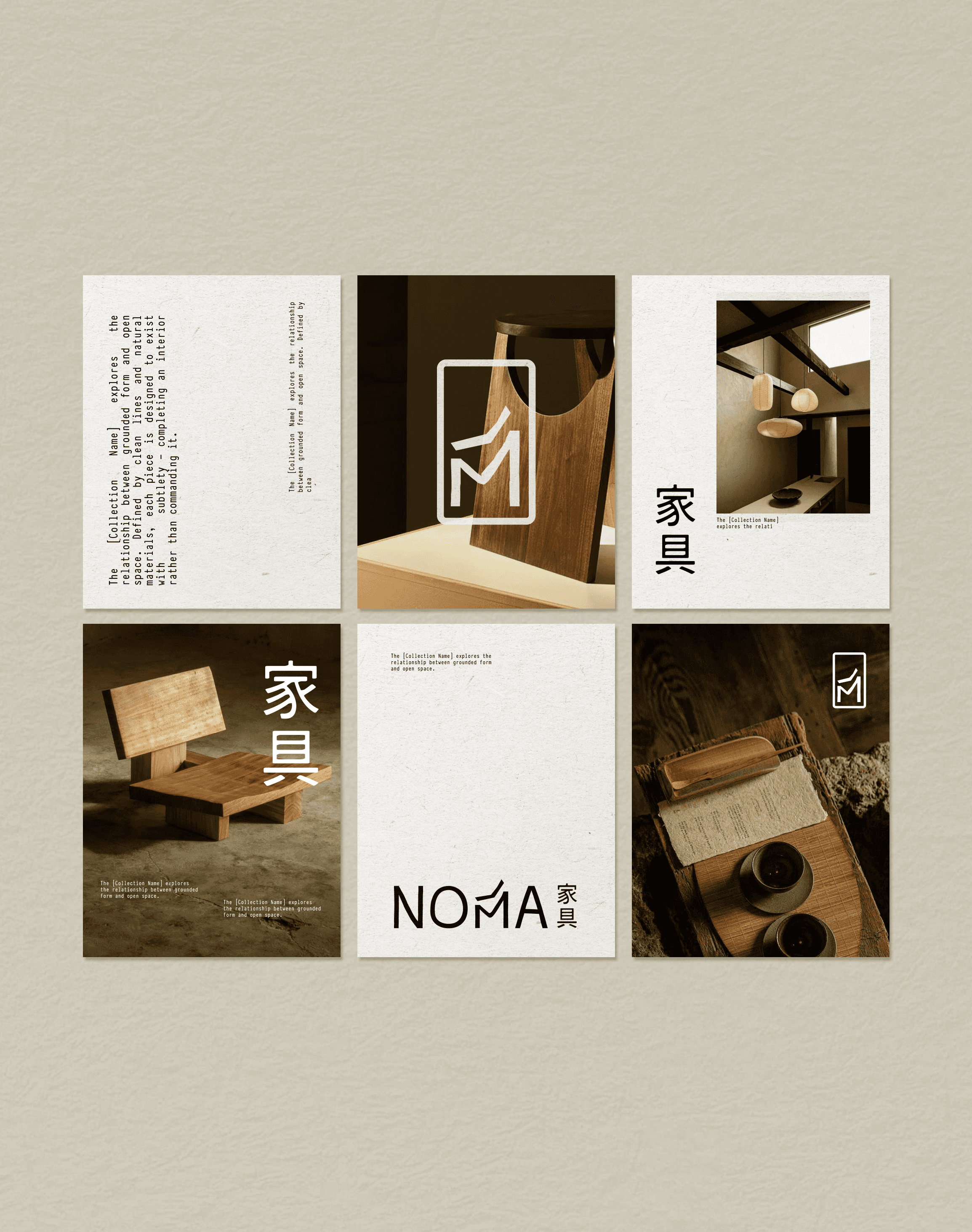
COLOR & MATERIAL
An "off-white matte" palette and high-contrast dark interiors mirror the tactile textures and architectural shadows of traditional Japanese interiors.
TYPOGRAPHY
Minimal, editorial typography is used with generous spacing to create a sense of quiet authority and structural balance.
LOGO MARK
The custom wordmark features a structural 'M' that doubles as a minimalist chair silhouette, bridging the gap between typography and furniture design.


begin your project
I’d love to hear more about your brand and what you're envisioning.