
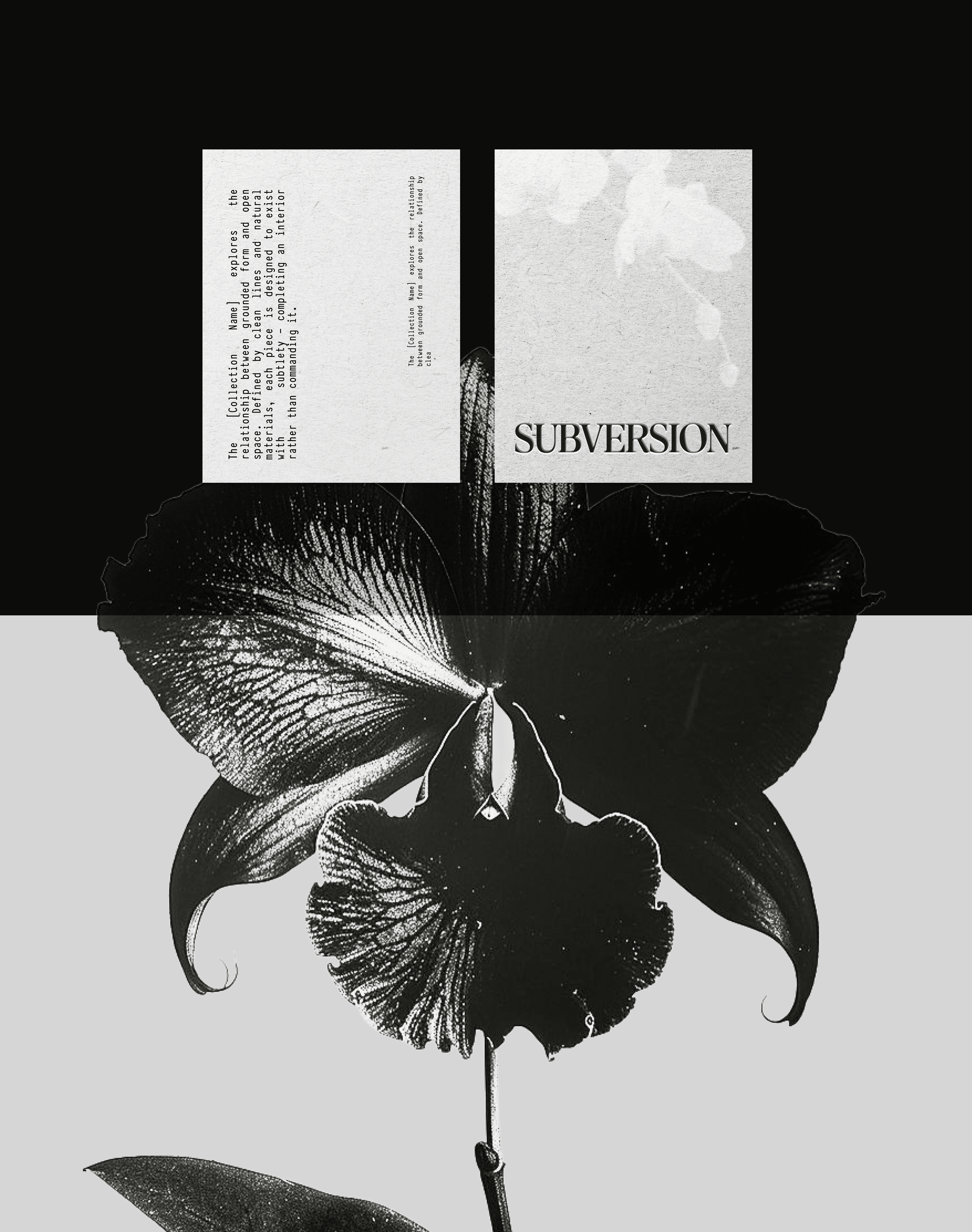
subversion
BRANDING & IDENTITY
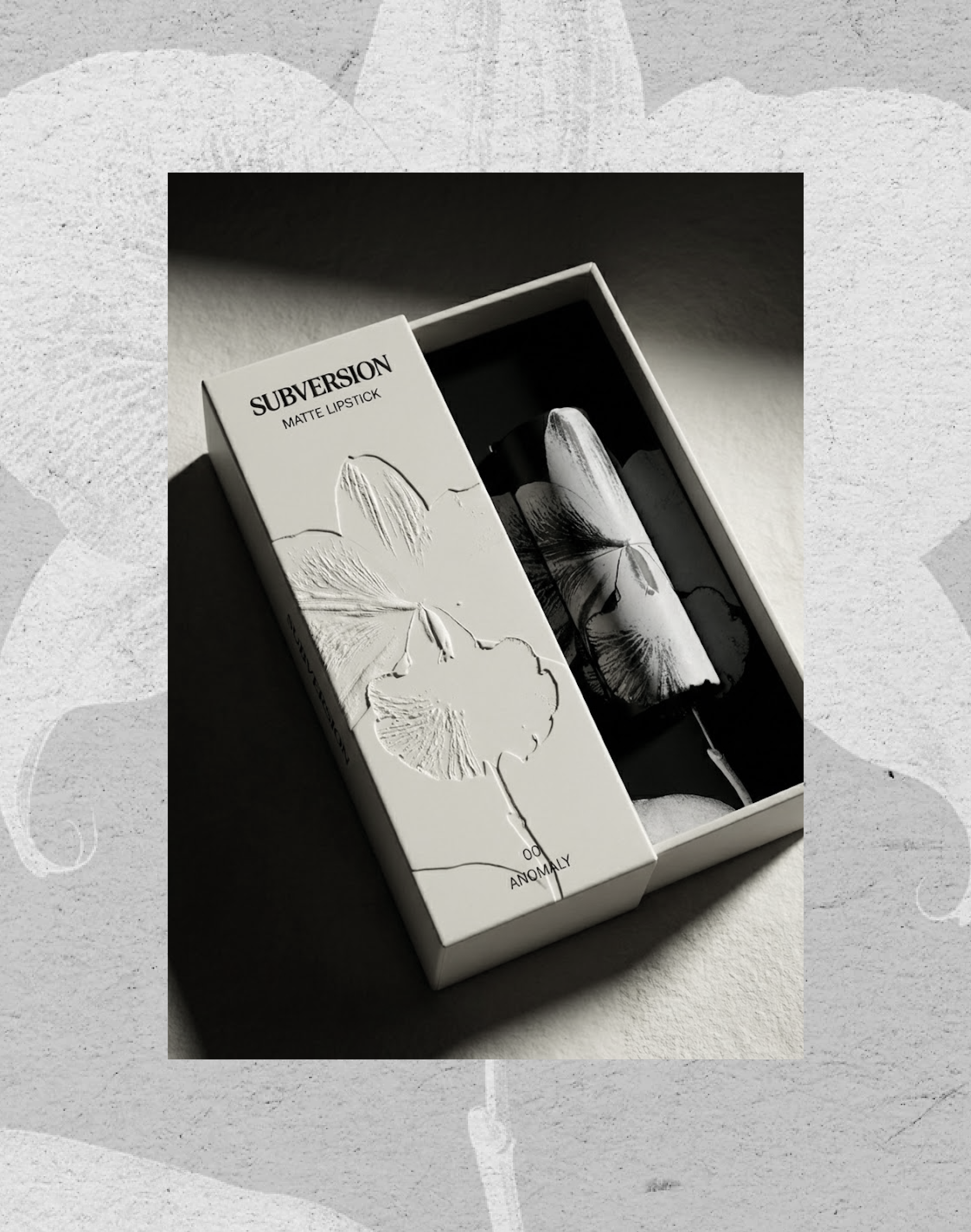
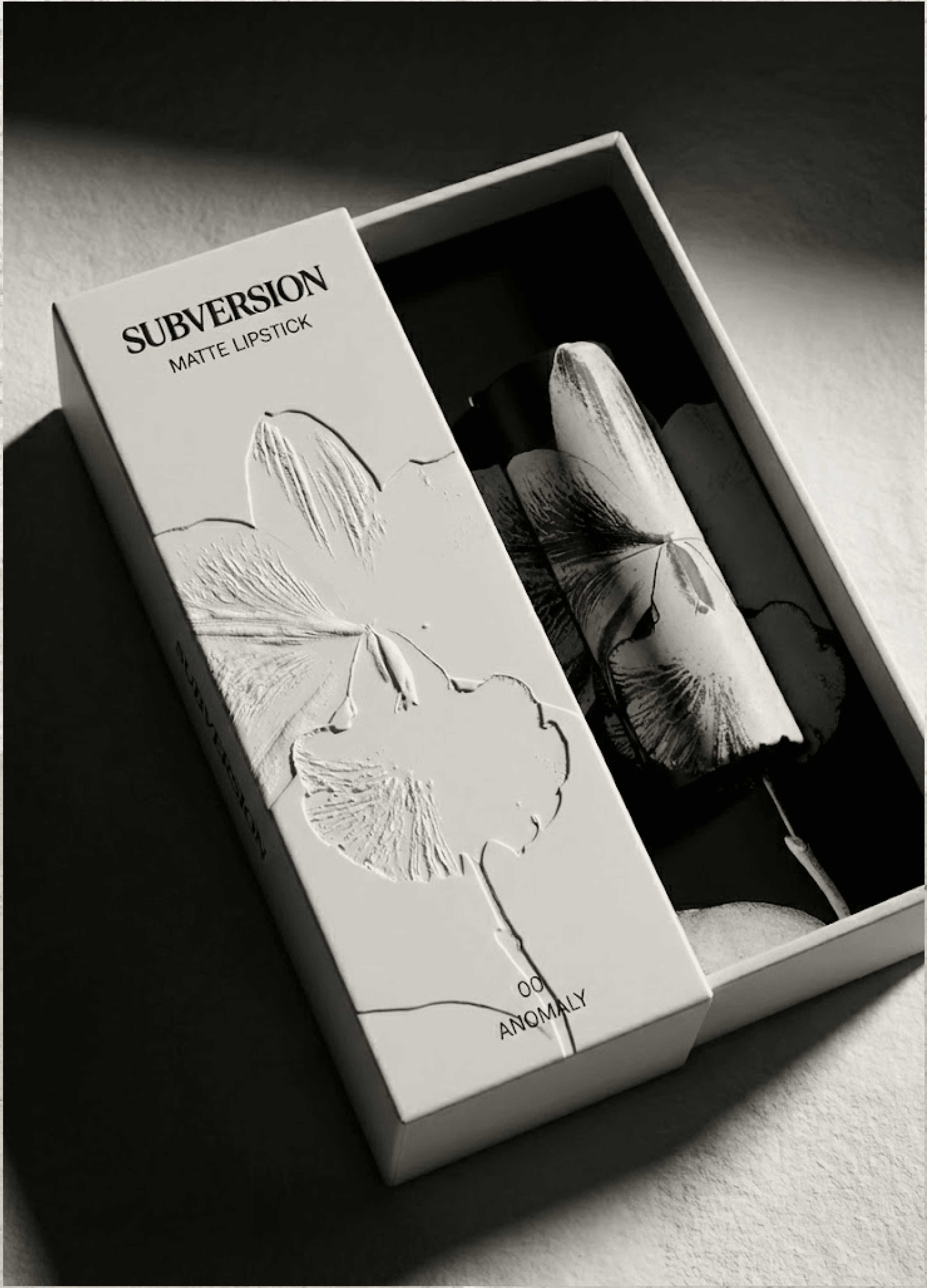
PACKAGING DESIGN
Subversion communicates quietly. Rather than relying on overt rebellion, the brand uses restraint to create tension, allowing contrast to emerge only through interaction. The packaging functions as both container and metaphor, rewarding engagement with an unexpected reveal.
(COLOR & MATERIAL)
Off-white matte exteriors reference traditional luxury and restraint. Dark, inverted interiors introduce contrast and tension
(TYPOGRAPHY)
Minimal, editorial typography used sparingly to maintain authority and quiet confidence
(MOTIF)
An orchid was selected as a recurring visual element—symbolizing beauty that is refined, controlled, and slightly unnatural


© Bleum 2026